For years, I designed under the name HSC Design. It was a name that meant a lot to me, built from my own initials and filled with ambition. But over time, something shifted. As I settled into life in Ras Al Khaimah and my work began to evolve alongside motherhood, I noticed a pattern: no one was calling it HSC Design anymore. Clients, collaborators, even friends, they all referred to it as Tunde Hendricks Design. And the more I heard it, the more it felt right. Personal. Clear. Aligned with the thoughtful, grounded way I now approach interior design. So I decided to make it official and that’s why I decided to rebrand.
My design philosophy
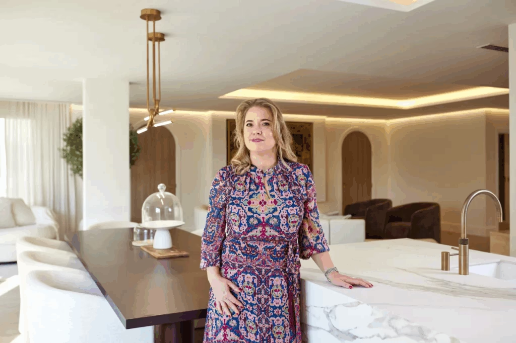
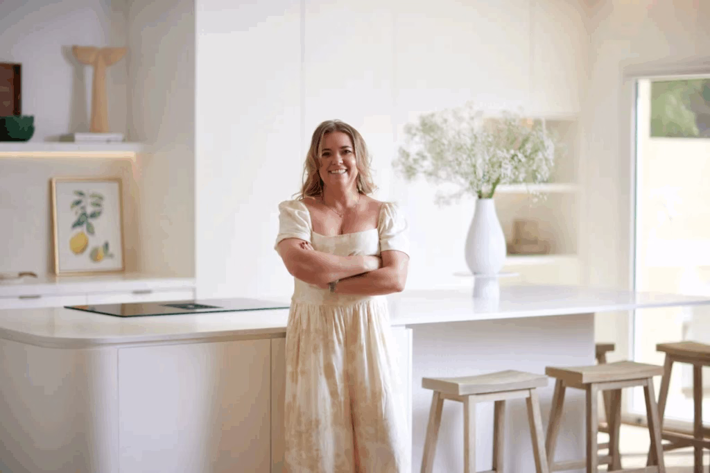
I’m a Hungarian architect and the founder of Tunde Hendricks Design, an interior design studio based in Ras Al Khaimah. I’m passionate — some might say obsessed — with creating beautiful, timeless spaces that elevate the way people live. But for me, interior design isn’t just about how things look. It’s about how they feel.
Design is deeply emotional. We don’t simply build beautiful spaces — we shape how people experience them. A well-designed home brings comfort, inspiration, and a true sense of belonging. Every detail matters. Every project is approached with heart, purpose, and intention.
This rebrand is about clarity. About owning my name and the creative voice behind it. About aligning my visual identity with the kind of design experience I want to create for every client I work with. And this is exactly why I decided to rebrand.
The meaning behind the new logo and why I decided to rebrand
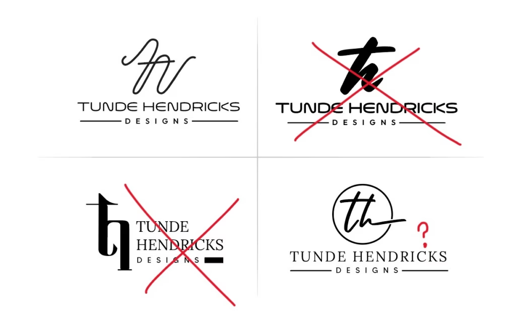
When it came to creating a new logo, I knew it had to feel like an extension of the spaces I design: refined, calm, and quietly confident. I didn’t want anything loud or overly trendy — I wanted something that would stand the test of time. Just like a well-designed home.
Every element of the new identity was chosen with purpose. The typography is clean and elegant, with just enough softness to reflect the warmth and care I bring to each project. The subtle, earthy tones speak to my love of natural materials and grounded spaces. There’s a sense of calm in the new visual language — a quiet luxury that mirrors the environments I create.
This isn’t just a logo. It’s a reflection of my design philosophy: thoughtful, emotional, intentional. It represents the feeling of coming home to a space that truly supports and uplifts you.
The logo design process
Like most creative things, the logo didn’t come together overnight. There were plenty of trial-and-error moments — sketches that didn’t feel quite right, fonts that looked beautiful but didn’t carry the right energy. I knew what I wanted it to feel like, but capturing that in a mark proved harder than expected.
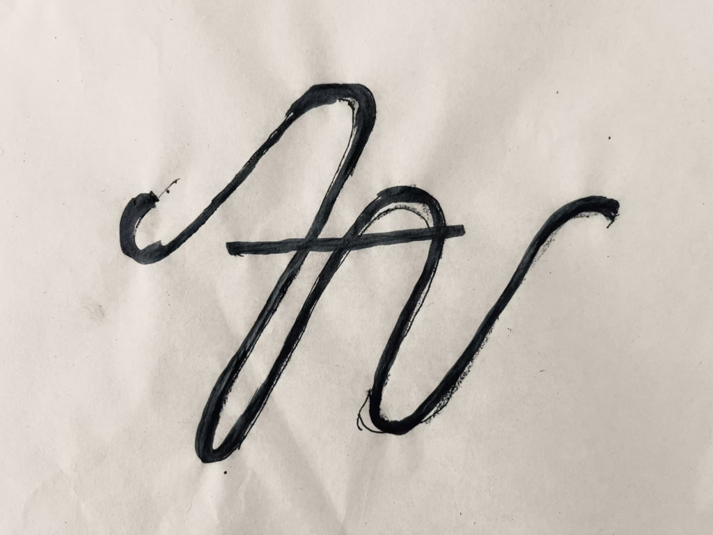
That’s when a dear friend and talented designer, Edina Johnson, came to the rescue. She understood the essence of what I was trying to say — not just visually, but emotionally. Edina took all the scattered pieces, the mood boards, the half-finished ideas, and turned them into something refined and quietly powerful. The result is a logo that feels effortlessly me.
It was a beautiful reminder that design, like life, is often a collaborative process — and that the right people can help you see yourself more clearly.
What this new identity represents
This new logo and visual identity aren’t just about looking fresh — they’re about what I want every client to feel when they work with me. Calm, confident, understood. A sense that their home is a true reflection of who they are, carefully crafted with intention and care.
The identity speaks to the heart of my design approach: creating timeless spaces that aren’t just visually beautiful, but deeply meaningful. It’s about comfort, inspiration, and belonging — the very feelings I strive to evoke in every project.
By embracing my own name and story, this identity also honours the personal journey that brought me here. It’s a promise to approach every space with authenticity, warmth, and purpose.
And now what?
Thank you for joining me on this exciting new chapter of Tunde Hendricks Design. This rebrand isn’t just a fresh look — it’s a reflection of my journey, my values, and my commitment to creating spaces that truly feel like home. I’m so grateful to all the clients, collaborators, friends, and family who have supported me along the way.
I can’t wait to continue this journey with you — designing timeless, heartfelt spaces that inspire and comfort. If you have any thoughts or feedback on the new look, I’d love to hear from you!
FAQs
Over time, my clients and collaborators naturally began referring to my studio by my name. It felt more personal, more authentic, and more aligned with how I approach design today — thoughtful, emotional, and deeply connected to the people I work with.
The name and visual identity have evolved, but my philosophy hasn’t. I still create calm, timeless spaces that reflect my clients’ personalities and support their lifestyles. The new identity simply expresses that vision more clearly.
I wanted a logo that felt like an extension of the spaces I design — elegant, grounded, and quietly confident. The refined typography and natural tones mirror the sense of calm and timelessness that defines my work.
The logo was created in collaboration with my dear friend and talented designer, Edina Johnson, who helped me capture the emotional essence behind my brand and translate it into a mark that feels effortlessly “me.”
It’s a renewed promise. A reflection of how I want every client to feel — calm, confident, understood. The new identity strengthens my commitment to designing spaces that are not just beautiful, but meaningful and deeply personal.